
Asian and Western Web Differ? | 매거진에 참여하세요
Asian and Western Web Differ?
#asia #europe #ux #difference #reason #analysis #strategy #compositio #design


Why Do East Asian and Western Web Apps Look So Different?
Exploring the cultural, technical, and strategic DNA behind UX design across regions
Why do global web apps feel so… different?
We live in a globally connected world,
yet web apps built in East Asia and those made in the US or Europe often look like they were designed on different planets.
Open an e-commerce app from East Asia
— it’s usually packed with colorful banners, endless categories, and feature-rich menus.
Now switch to a US or European app. Suddenly, there’s whitespace, minimal icons, and just a few simple CTAs. It almost feels empty.
But this isn’t just about aesthetics.
It reflects deep-rooted cultural habits, monetization logic, infrastructure maturity, and user expectations.
Let’s unpack the why behind these differences — and what to consider if you’re building a product for global users.
1. Attitude Toward Information:
Micro-navigation vs. Macro-intent
East Asian users often love to explore. Their apps are built for browsing, not just searching. Take a typical shopping app: there are categories by product type, brand, theme, season, promotion — all readily visible.
🛍️ Example: Coupang (KR) vs. Amazon (US)
Coupang displays banners, curated events, flash sales, and menus upfront.
Amazon emphasizes search and shows only a few high-level recommendations.
Western users, on the other hand, lean towards task completion.
They don’t want to see everything — just the thing they came for. The UX is built around fast search and minimal clicks.
2. Design Language:
Playful & Dense vs. Minimal & Spacious
Design sensibility reflects culture. In East Asia (including Japan, Taiwan, Korea),
there's a preference for playfulness, color, density, and decorative elements — badges, stickers, emojis, gradients.
🧭 Example: Naver (KR) vs. Google (US)
Naver packs news, search, weather, forums, shopping, and more into one page.
Google shows only a logo and search bar — that’s it.
Meanwhile, Western UX philosophy finds beauty in restraint.
Fewer icons, ample whitespace, and purposeful typography create a more relaxed interface.
3. Infrastructure & Device Norms
East Asia has some of the fastest mobile networks in the world. HD streaming in subway tunnels is common.
That makes mobile apps in the region more comfortable with heavy content density and rich UI features.
In contrast, the West transitioned from desktop-first to mobile, so its mobile UX tends to strip things down
— prioritizing efficiency and load speed, even if it sacrifices discoverability.
4. User Behavior:
Exploratory vs. Goal-Oriented
East Asian apps encourage discovery. Community platforms like blogs and forums (e.g., Naver Cafe, PTT, or Line communities) are central to daily digital life. Users often dig through tabs, lists, and submenus for new content.
Western users are more goal-oriented. Their preferred UX pattern is:
search → result → action → done.
💬 Example: KakaoTalk vs. WhatsApp
KakaoTalk is a super app: messaging, games, gifts, news, shopping — all in one.
WhatsApp focuses only on messaging. No ads. No frills.
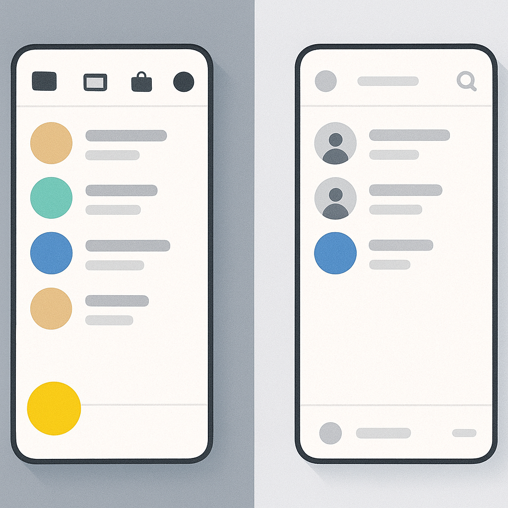
This is why East Asia embraced the super app model, while the West resisted it, seeing it as “bloated.”
5. Monetization Shapes Design
Many East Asian apps monetize through ads, partnerships, and product placement.
That’s why you’ll see more banners, carousels, and promotional sections baked into the UX.
In contrast, Western apps more commonly rely on subscriptions and paid tiers, which reward a cleaner, more premium interface.
Too many ads in a Western app? It quickly loses user trust.
So what happens when you go global?
If you launch an East Asian-designed app in the West as-is, it may feel overwhelming or noisy to local users.
Flip it around — bring a Western minimalist design to East Asian markets — and it could feel too empty or hard to navigate.
That’s why many global SaaS and commerce platforms now tailor their UX by region:
Element | East Asia | US / Europe |
|---|---|---|
Info Density | Dense, layered | Sparse, prioritized |
Menu Structure | Visible & deep | Hidden & searchable |
Aesthetic | Colorful, decorated | Clean, restrained |
Revenue Model | Ads, curation | Subscription, upsell |
User Flow | Discovery-driven | Goal-oriented |
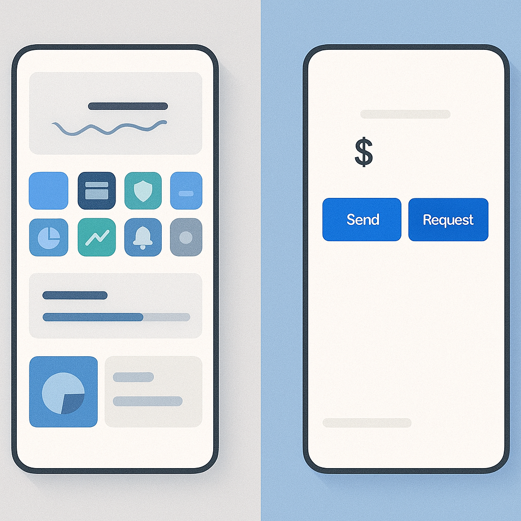
🧾 Example: Toss (KR) vs. PayPal (US)
Toss integrates savings, loans, insurance, cards, and payments all into a single super app interface.
PayPal keeps it simple: send, receive, pay — nothing else is emphasized.
Toss is like a financial control center. PayPal is a transaction tool.
Final Thought: Design Is Strategy
Design isn’t just how something looks. It’s how a product thinks.
If you're building for a global audience, design should never be one-size-fits-all.
Whether you're working on a fintech product, a marketplace, or a messaging app,
consider how local culture, habits, and business models will shape what your users expect.
Start minimal. Then adapt. Sometimes the smartest global UX isn’t the simplest
— it’s the one that feels native to whoever's holding the phone.
🌐 Want to design web apps for cross-border success?
Check out tools like bunzee.ai that help teams prototype, test, and localize design patterns tailored to regional behavior.

- link_kakaolink_kakao_url
- link_operatorlink_operator_url
- link_investhelp@letspl.me
- link_ad_urllink_ad
